 833-377-8663

Best Kitchen Cabinet Paint Colors for 2026

Table of Contents
- Kitchen Cabinet Paint Colors Dominating 2026
- The Rise of New Neutrals: Greige and Warm Whites
- Deep and Moody Green Tones for Sophisticated Kitchens
- Inky and Muted Blue Palettes
- Warm Earthy Tones: Terracotta and Clay
- Two-Tone Kitchen Cabinet Ideas for Visual Impact
- Best Cabinet Paint Finishes for Durability and Performance
- How to Paint Kitchen Cabinets Professionally
- Frequently Asked Questions
Last Updated: September 22, 2026
Kitchen Cabinet Paint Colors Dominating 2026
The best kitchen cabinet paint colors for 2026 reflect a shift toward sophistication and personality. Gone are the days when neutral beige dominated every kitchen. Today's homeowners and designers are embracing deeper tones, moody palettes, and unexpected color combinations that transform cabinets from functional storage into design statements.
What's driving this trend? People want their kitchens to feel intentional. A carefully chosen cabinet color signals that you've thought about your space, not just defaulted to what was easiest. The colors trending this year share something in common: they work with natural light, they age well, and they pair seamlessly with popular hardware finishes like brass and matte black.
At RTA Wholesalers, we've helped hundreds of homeowners and contractors navigate color selection for their kitchen renovations. The question we hear most often isn't "what color should I choose?" but rather "how do I know this color will work in my space?" Below, we'll walk you through the trending kitchen cabinet paint colors that are defining 2026, plus the practical factors that determine whether a color will succeed in your kitchen.
The Rise of New Neutrals: Greige and Warm Whites
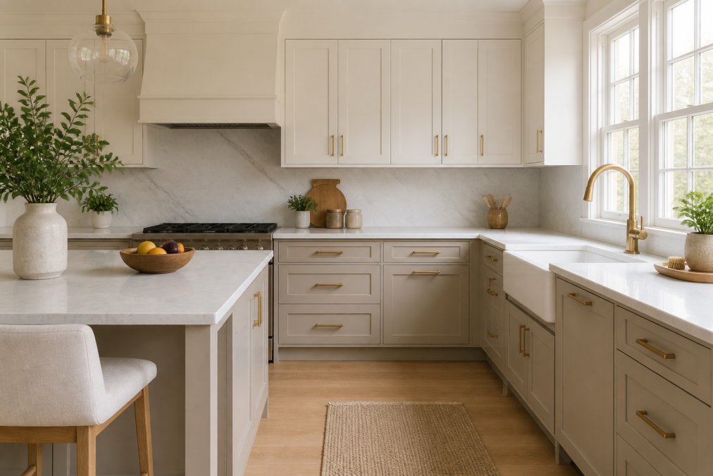
Greige, a sophisticated blend of gray and beige, has become the new neutral for kitchens that want depth without drama. Unlike pure gray, which can feel cold, greige brings warmth while maintaining the clean, modern aesthetic homeowners crave. The undertones matter here: greige with warm undertones feels inviting, while cooler greige reads more contemporary.
Warm whites are also making a comeback, but not the stark, sterile white of years past. Today's warm whites have subtle undertones of cream, ivory, or soft yellow. These colors reflect light beautifully, making kitchens feel larger and brighter. They're also forgiving, they hide dust and fingerprints better than pure white, and they work with virtually any hardware or countertop material.
The appeal of new neutrals lies in their versatility. A greige or warm white cabinet serves as a backdrop for bold countertops, statement hardware, or colorful kitchen islands. Many homeowners use these colors on upper cabinets while choosing a bolder tone for lower cabinets, creating visual interest without overwhelming the space. Balancing these subtle shades with more dramatic accents requires a thoughtful approach to choosing cabinet colors that harmonize with the rest of your home.
Deep and Moody Green Tones for Sophisticated Kitchens
Deep green is having a moment, and for good reason. Sage green, forest green, and muted olive tones create a sense of calm sophistication that feels both timeless and current. These colors work particularly well in kitchens with natural wood elements or warm countertops, where they ground the space and add herbaceous character.
The key to pulling off moody green is understanding undertones and lighting. A green with blue undertones can feel cold in dim kitchens, while a green with warm yellow undertones feels more welcoming. Test your chosen green under the actual lighting conditions in your kitchen, morning light, afternoon light, and evening light all reveal different facets of the color.
Moody greens pair beautifully with brass hardware, white quartz countertops, and open shelving that displays white dishware or glassware. They're also an excellent choice for kitchen islands, where the color can be contained and doesn't overwhelm the entire space. RTA Wholesalers offers Custom Color Inset cabinetry in any Sherwin-Williams color, including the full range of sophisticated green tones trending this year, with no color upcharge regardless of which shade you select.
Inky and Muted Blue Palettes
Navy blue and inky blue represent the darker end of the color spectrum, and they're becoming increasingly popular for kitchens that want drama without darkness. Unlike pure black, which can feel harsh, inky blue reads as sophisticated and slightly mysterious. Muted blues, think dusty blue or slate blue, offer a softer alternative that still provides visual weight and contrast.
Blue cabinets work best as a feature element. Many designers use inky blue on lower cabinets or a kitchen island, pairing it with lighter uppers to prevent the space from feeling too heavy. The color pairs exceptionally well with white or cream countertops, stainless steel appliances, and chrome or brushed nickel hardware.
The durability of blue paint matters. Darker colors show dust and water spots more readily than lighter tones, so choose a finish that's easy to clean. A satin finish strikes the right balance between sheen and practical maintenance.
Warm Earthy Tones: Terracotta and Clay
Terracotta and clay tones bring warmth and earthiness to contemporary kitchens. These colors nod to natural materials and organic design, creating spaces that feel grounded and inviting. Terracotta leans toward orange-red undertones, while clay is more neutral with warm brown undertones.
These colors work best in kitchens with abundant natural light and warm countertop materials like butcher block, warm-toned granite, or terracotta tile. They're less forgiving in dim kitchens, where they can appear muddy or dated. Pair earthy tones with natural wood open shelving, woven baskets, and warm-toned hardware for a cohesive, intentional look.
Glass Ready, 9″ to 51″ Heights, Custom →
Warm earthy tones are particularly effective for creating a transitional or rustic aesthetic. They appeal to homeowners who want their kitchens to feel less sterile and more connected to natural materials and warmth.
Two-Tone Kitchen Cabinet Ideas for Visual Impact
Two-tone cabinetry, using different colors for upper and lower cabinets, has become a dominant design trend. This approach allows homeowners to embrace color without committing their entire kitchen to a bold choice. The most effective two-tone combinations pair a neutral upper with a deeper lower, or a light upper with a moody green or blue lower.
Common two-tone pairings include:
- Warm white uppers with sage green lowers
- Soft cream uppers with inky blue lowers
- Greige uppers with terracotta lowers
- White uppers with navy lowers
The kitchen island is another opportunity for two-tone impact. Many designs feature white or cream cabinetry throughout, with a contrasting island in green, blue, or gray. This approach grounds the space and creates a natural focal point.
When planning a two-tone kitchen, consider how the two colors interact under your kitchen's lighting. Warm and cool tones can clash if not carefully balanced. A professional kitchen design service can help you visualize the combination before you commit, and RTA Wholesalers offers a free kitchen design service to help ensure your color choices work together and with your overall layout.
Best Cabinet Paint Finishes for Durability and Performance
The color you choose matters, but so does the finish. Kitchen cabinets endure daily wear: moisture from cooking, fingerprints, spills, and constant opening and closing. The right finish protects your color investment and determines how easy your cabinets are to maintain.
Matte vs. Satin: Choosing the Right Sheen
A matte finish has no shine and provides a velvety, contemporary appearance. It hides dust, fingerprints, and imperfections beautifully, making it ideal for high-traffic kitchens or homes with children. The downside: matte finishes are more difficult to clean. Spills and splatters require gentle wiping to avoid leaving marks or damaging the finish.
A satin finish has a subtle sheen that sits between matte and semi-gloss (How to Choose Paint Finishes).
| Finish Type | Appearance | Maintenance | Best For |
|---|---|---|---|
| Matte | Velvety, no shine | Requires gentle cleaning | Modern aesthetics, hiding imperfections |
| Satin | Subtle sheen | Easy to clean | Most kitchens, balanced look and function |
| UV-cured lacquer | Smooth, professional | Highly durable | Custom cabinets, long-term durability |
How Lighting Affects Cabinet Color Selection
Natural and artificial lighting dramatically influence how cabinet colors appear. A color that looks sophisticated in the showroom might feel different under your kitchen's specific lighting conditions.
How to Paint Kitchen Cabinets Professionally
Painting existing kitchen cabinets is a viable alternative to replacement, but the process demands precision. Professional results require proper preparation, quality materials, and patience.
Frequently Asked Questions
What are the most popular kitchen cabinet paint colors for 2026?
The top trends for 2026 include greige (a blend of gray and beige), sage green, navy blue, and warm earthy tones like terracotta. These colors offer sophistication while maintaining neutrality. Greige works well with both warm and cool undertones, making it versatile across different kitchen designs. Sage green has become the herbaceous alternative to gray, bringing calm and natural appeal. Navy delivers moody elegance, while terracotta adds warmth and personality to contemporary kitchens.
What Sherwin-Williams kitchen cabinet paint colors work best for 2026 design?
Sherwin-Williams offers over 1,500 colors, with standouts for 2026 including Alabaster (warm white), Urbane Bronze (deep neutral), Tricorn Black (inky depth), and Sea Salt (soft greige). Many homeowners and contractors choose from their extensive palette to match their exact vision. Custom Inset cabinets can be finished in any Sherwin-Williams color at no upcharge, allowing you to select precisely the undertone and saturation you need for your space.
Are two-tone kitchen cabinets still in style for 2026?
Yes, two-tone cabinets remain a strong trend through 2026. The most popular combinations pair lower cabinets in deeper, moodier colors (navy, forest green, or charcoal) with upper cabinets in lighter neutrals (white, cream, or greige). This approach adds visual interest and dimension while keeping the kitchen from feeling too dark. Two-tone schemes also allow you to balance color drenching with lighter accents, creating depth without overwhelming the space.
How do I choose a cabinet color that will stay relevant through 2026 and beyond?
Focus on undertones rather than trend-chasing. Colors with warm undertones (greige, warm white, terracotta) age better than those with cool undertones, which can feel dated quickly. Consider your kitchen's lighting and how natural and artificial light interact with your chosen color throughout the day. Test paint samples in your actual space, observing them at different times. Neutral base colors paired with trendy hardware and accessories offer flexibility, you can refresh the look without repainting cabinets.


