 833-377-8663

Modern Two-Tone Kitchen Cabinet Color Combinations

Table of Contents
- Why Two-Tone Kitchen Cabinets Create Visual Depth
- White and Wood Kitchen Cabinets: Timeless Contrast
- Green and White Kitchen Cabinets: Fresh Modern Appeal
- Navy, Blue, and Neutral Pairings for Contemporary Kitchens
- Two-Tone Kitchen Cabinets with Dark Lower Cabinets
- How to Choose Two-Tone Cabinet Colors for Your Space
- Coordinating Two-Tone Cabinets with Countertops and Hardware
- Avoiding Common Two-Tone Cabinet Mistakes
- Frequently Asked Questions
Last Updated: October 6, 2026
Why Two-Tone Kitchen Cabinets Create Visual Depth
Two-tone kitchen cabinets use contrasting upper and lower colors to add dimension and visual interest. This approach is central to modern kitchen aesthetics because it breaks up large cabinet runs and guides the eye intentionally.
The contrast between light and dark tones creates what designers call "visual weight distribution." Lighter uppers with darker lowers draw the eye upward, making ceilings feel taller; dark uppers with light lowers ground the space.
What makes modern two-tone kitchen cabinet color combinations so effective is that they solve a real problem: solid-color cabinets can feel flat and monolithic. Two-tone palettes add breathing room and sophistication without structural changes, and they work across farmhouse, contemporary, and transitional styles because contrast creates interest.
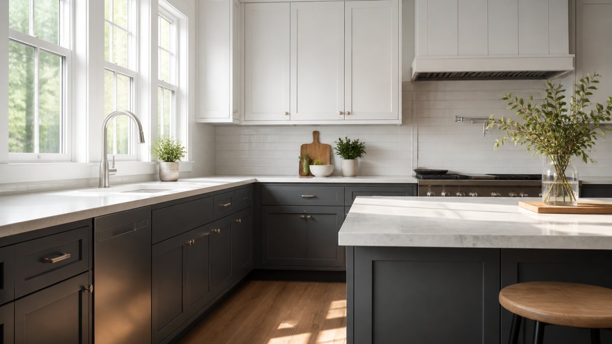
The depth comes from how eyes process color and value: lighter colors recede, darker tones advance. A kitchen that feels cramped in one color suddenly breathes with strategic contrast.
White and Wood Kitchen Cabinets: Timeless Contrast
White and wood combinations represent the most enduring approach to two-tone kitchen cabinet color combinations. The pairing works because white provides a clean, modern foundation while natural wood grain adds warmth and organic texture that prevents the space from feeling sterile.
This combination bridges traditional and contemporary aesthetics: white shaker cabinets on top create a light, airy feel, while warm wood tones below ground the design. The contrast is refined rather than jarring because both colors sit on the warm-to-neutral spectrum.
When selecting wood tones to pair with white uppers, consider undertones. Honey oak and walnut veneer bring golden warmth; darker walnut stains create more dramatic contrast while staying cohesive. The key is enough visual weight to balance the white without overwhelming it.
RTA Wholesalers offers white shaker options in custom sizes and colors.
Hardware matters with white and wood pairings. Brass, brushed gold, or warm bronze pulls enhance the natural wood and keep the white from feeling clinical; matte black shifts the look toward modern minimalism rather than timeless warmth.
Green and White Kitchen Cabinets: Fresh Modern Appeal
Green and white kitchen cabinets have emerged as the defining color pairing of contemporary kitchen design. Sage green, forest green, and soft olive tones pair with white uppers to create a look that feels both current and grounded in nature.
The appeal lies in how green functions as a neutral: softer greens recede visually while still providing distinct color definition. Paired with white uppers, green lower cabinets create a fresh, organic aesthetic that works in traditional and modern kitchens.
Sage green is the most versatile choice for two-tone kitchen cabinet color combinations. It pairs beautifully with white quartz or marble countertops, brass hardware, and natural wood accents, and reads as calming and sophisticated rather than trendy.
RTA Wholesalers carries sage green shaker base cabinets in multiple widths to fit your layout, with plywood construction and soft-close hinges for durability in high-traffic kitchens. Pairing these with white uppers creates an instantly cohesive, designer-approved look.
Forest green works in larger spaces or kitchens with dramatic lighting where the darker tone won't feel heavy. Pair it with crisp white uppers and warmer countertop materials like butcher block or warm-toned quartz to prevent a cold palette.
Navy, Blue, and Neutral Pairings for Contemporary Kitchens
Navy and blue lower cabinets paired with white or cream uppers represent the most popular modern two-tone kitchen cabinet color combinations in contemporary design. Navy offers sophistication and depth while remaining neutral enough to coordinate with almost any countertop or backsplash material.
Navy is versatile across lighting conditions: in bright kitchens it reads as a rich, confident anchor, and in softer natural light it becomes deeper and more grounded. Blue works similarly but feels fresher and more casual, useful for modern appeal without formality.
For neutral pairings beyond white, consider cream or soft taupe lower cabinets with light gray or white uppers. These subtle combinations offer definition without contrast, refined and timeless for kitchens where countertops, backsplash, and hardware are the visual stars.
Charcoal gray lower cabinets with white uppers create a crisp, modern aesthetic that works in transitional and contemporary kitchens. The contrast is clear but not dramatic, and gray coordinates seamlessly with stainless steel appliances and cool-toned countertops.
RTA Wholesalers offers gray shaker base cabinets constructed with plywood and soft-close hardware. These work beautifully as lower cabinets in a two-tone scheme, providing the visual weight and definition that makes the design sing.
Two-Tone Kitchen Cabinets with Dark Lower Cabinets
Dark lower cabinets with light uppers represent the most popular approach to modern two-tone kitchen cabinet color combinations. This configuration works because it mirrors natural visual hierarchy, anchoring the space while keeping the upper zone bright and open.
The psychology is straightforward: dark bases feel grounded and substantial, while light uppers create height and airiness. In kitchens with limited ceiling height, this pairing is especially valuable because the visual effect compensates for spatial constraints.
Charcoal, navy, forest green, and rich taupe all work as dark lower options, depending on your lighting, countertops, and style. In warm kitchens with golden light, taupe or warm charcoal feel inviting; in cool northern light, navy or forest green provide needed warmth.
29 Newport White Double Shaker 1-1/4" Overlay Sink Base 30", 33" & 36" →
One common mistake is choosing dark lowers that are too muted or muddy. The best have clear color identity, true navy, rich charcoal, or saturated green, while wishy-washy grays or browns create visual confusion rather than intentional contrast.
| Cabinet Configuration | Best For | Visual Effect |
|---|---|---|
| Dark lower, light upper | Most kitchens | Grounded yet airy |
| Light lower, dark upper | High ceilings, dramatic style | Modern, unconventional |
| Neutral lower, white upper | Subtle definition | Refined, timeless |
| Matching upper and lower | Small spaces | Cohesive, spacious |
Pairing dark lower cabinets with the right countertop matters. White or light gray quartz keeps the palette fresh, warm wood grounds it naturally, and countertops too close in value to your dark cabinets create a heavy, cave-like effect.
How to Choose Two-Tone Cabinet Colors for Your Space
Selecting the right modern two-tone kitchen cabinet color combinations requires understanding your kitchen's lighting, size, existing materials, and style. A color that works in a bright, south-facing kitchen may feel heavy in a north-facing space with limited natural light.
Start by assessing your kitchen's lighting. Warm, golden light allows deeper, richer tones without gloom, while cool, blue-toned light (common in north-facing kitchens) pairs better with warmer cabinet colors. With mixed lighting, choose colors that perform well across the day.
Next, consider existing materials. Countertops, backsplash, flooring, and appliances constrain your cabinet color choices: warm wood flooring feels cohesive with white and warm wood cabinets or green and white combinations, while cool gray or white countertops harmonize with navy, charcoal, or soft taupe lowers.
Room size matters: small kitchens benefit from light uppers and darker lowers used sparingly, while larger kitchens and open-plan layouts can handle bolder two-tone combinations because the visual weight distributes across more area.
Test your color choices before ordering. Paint large cardboard samples and place them in your kitchen at different times of day, observing morning, afternoon, and evening light. This simple step prevents costly mistakes that only become obvious after cabinets arrive.
Coordinating Two-Tone Cabinets with Countertops and Hardware
Your countertop and hardware selections make or break a two-tone cabinet design, either harmonizing with your cabinet colors or creating visual discord that undermines the scheme.
For white and wood cabinets, warm countertops like butcher block, warm marble, or honey-toned quartz enhance the natural aesthetic, and brass or warm bronze hardware reinforces the warmth. Cool gray or white quartz works too, paired with matte black or brushed nickel hardware.
Green and white cabinets pair beautifully with white marble or light gray quartz, and brass hardware brings out warm undertones in the green. With deeper forest green, choose slightly warmer countertop tones to prevent a cold palette.
Navy and blue lower cabinets work with nearly any countertop because blue is adaptable: white or light gray quartz feels fresh and modern, warm wood adds traditional warmth, and even darker countertops work for a dramatic, sophisticated look.
Hardware finish significantly influences how two-tone cabinets read: brass and gold warm any palette, brushed nickel and chrome feel contemporary and cool, and matte black creates modern contrast. Choose hardware that complements your countertop undertones rather than fighting them.
Avoiding Common Two-Tone Cabinet Mistakes
The most frequent error with modern two-tone kitchen cabinet color combinations is choosing colors that lack sufficient contrast.
Another common mistake is pairing colors with conflicting undertones, warm taupe lowers with cool white uppers create unintentional visual tension. Ensure your choices either harmonize (both warm, both cool, both neutral) or create intentional, dramatic contrast.
Selecting dark lower cabinets that are too muted or muddy undermines the design. Choose colors with clear identity: true navy, rich charcoal, saturated green, or warm taupe.
Many homeowners also fail to account for how colors perform in their actual kitchen lighting. A color that looks perfect in a showroom may feel completely different at home, which is why testing samples in your actual space is non-negotiable.
Ignoring hardware and countertop coordination is equally problematic. Cabinets exist within a complete material ecosystem. If your hardware clashes with your countertop undertones, the entire palette feels disconnected.
| Mistake | Why It Fails | How to Avoid |
|---|---|---|
| Insufficient contrast | No visual definition | Choose colors at least 3-4 shades apart |
| Conflicting undertones | Colors fight each other | Keep undertones consistent or intentionally dramatic |
| Muted dark tones | Looks indecisive | Select colors with clear, saturated identity |
| Ignoring lighting | Color changes throughout day | Test samples in your actual kitchen |
| Mismatched hardware | Palette feels scattered | Coordinate hardware with countertop tone |
Choosing the right modern two-tone kitchen cabinet color combinations requires understanding how color, light, and material work together in your space.
RTA Wholesalers provides the cabinet options you need to execute any two-tone vision. Our custom color inset cabinetry is available in most any size, and our ready-to-assemble construction means you can achieve a professional look in your spaces.
Frequently Asked Questions
What are the trendy two-tone kitchen cabinet colors for 2026?
Sage green paired with white, navy blue with cream, and charcoal or dark gray base cabinets with light uppers remain strong choices. Warm neutrals like taupe and mushroom are also gaining traction for a refined, contemporary look. The key is balancing cool and warm undertones to create a cohesive palette that complements your kitchen's lighting and layout.
Should upper or lower kitchen cabinets be darker in a two-tone design?
Darker lower cabinets with lighter uppers is the most common approach. This creates visual balance, grounds the kitchen, and makes the space feel larger by drawing the eye upward. However, the reverse can work in kitchens with high ceilings or abundant natural light. Test your color choices with samples before committing to ensure they work with your specific space.
How do you choose a countertop for two-tone cabinets?
Your countertop should bridge the two cabinet colors or echo one of them subtly. White quartz works well with most two-tone schemes, while warm wood tones complement green or taupe cabinets. Consider the undertones in both your cabinet colors and choose a countertop that harmonizes rather than competes. Backsplash and hardware should also tie the scheme together for a refined, intentional look.
Are two-tone kitchen cabinets still in style?
Yes. Two-tone cabinets remain a strong design trend because they add depth, visual interest, and sophistication to modern kitchens. They work well in open-plan layouts and help define different zones. The key to keeping the look current is choosing color pairings that feel intentional and coordinating them carefully with countertops, backsplash, and hardware rather than treating them as an afterthought.


