A cabinet color can make a kitchen look current or dated before the first appliance is installed. That is why kitchen cabinet color trends matter to contractors, designers, and homeowners trying to balance resale appeal, personal taste, and project cost. The right finish does more than look good on a sample door. It has to work with flooring, counters, lighting, cabinet style, and the level of maintenance a client will actually accept.
What kitchen cabinet color trends are really showing
The market is moving toward colors that feel grounded, flexible, and easier to live with over time. That does not mean every kitchen is turning neutral. It means buyers are choosing color with more discipline. Instead of chasing one bold finish across every wall, they are using cabinet color to support the layout, the light in the room, and the budget.
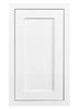
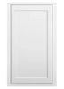
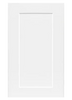
Warm whites remain strong because they solve a lot of practical design problems. They keep smaller kitchens open, pair well with most countertop materials, and appeal to a wide range of buyers. But the bright, stark white look that dominated for years is giving way to softer whites with more depth. Finishes like snow white and vintage white stay clean and versatile, while cream-based tones help reduce the cold feel that some all-white kitchens can create.
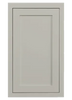
Gray is still relevant, but it has narrowed into more specific uses. Cool grays are no longer the default answer for every remodel. Warmer grays, including finishes like tuscan gray, are performing better because they bridge painted cabinets and natural materials more effectively. They also sit more comfortably with today’s warmer wood floors and mixed-metal hardware.
At the same time, color is showing up in more intentional ways. Blue, sage, and black are all active trends, but each works best in the right application. These are not one-size-fits-all finishes. They need the right room conditions and the right cabinet style to deliver value instead of visual weight.
The cabinet colors leading the market
If the goal is broad appeal with low risk, warm white and cream still lead the field. They work in both inset and overlay kitchens, support shaker styling especially well, and give remodelers a finish that rarely creates friction with countertop or backsplash selection. For builders and investors, these shades are often the safest path because they make the kitchen feel updated without overcommitting to a trend that could shorten the design’s lifespan.
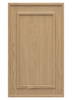
Cream is gaining more attention because it softens the room without looking yellow when paired correctly. In homes with warmer flooring, brass accents, or natural wood elements, cream can feel more integrated than a sharper white. The trade-off is that cream needs careful coordination under artificial light. A finish that looks balanced in daylight can lean too warm at night if the lighting plan is poor.
Sage green
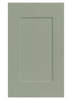
Sage has become one of the most practical color-forward options in kitchen cabinetry. It gives buyers something more distinct than white or gray, but it stays grounded enough to work as a long-term finish. In shaker doors, sage reads clean and current rather than themed. It also pairs well with butcher block, white quartz, warm marble looks, and natural oak accents.
The main strength of sage is versatility across project types. Designers can use it in a full kitchen, while remodelers working within tighter budgets can use it on an island or lower cabinets and keep uppers light. That said, sage is not universal. In rooms with very cool flooring or harsh LED lighting, it can lose its softness and look flatter than expected. Samples matter here.
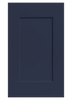
Blue
Blue cabinets continue to perform because they add character without becoming too niche. Deep navy and softer muted blues are both in demand, especially in kitchens that need a visual anchor. Blue works particularly well on islands, base cabinets, or as part of a two-tone layout. It gives enough contrast to define the room while still staying familiar to most buyers.
The key with blue is saturation. Very dark blue can look rich and custom in a well-lit kitchen, but in a room with limited natural light it may read almost black. Lighter blues can open up a space, but they need disciplined material selection around them or the kitchen can start to feel less cohesive. Contractors and homeowners should treat blue as a finish that benefits from a full room plan, not a stand-alone style choice.
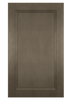
Natural oak and birch tones
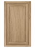
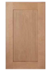
Wood is back in a more refined way. Instead of heavy orange stains or overly rustic finishes, buyers are leaning toward lighter natural looks such as oak and birch. These finishes bring warmth, texture, and variation that painted cabinets cannot replicate. They are especially effective in kitchens where clients want a cleaner design without making the room feel flat.
Natural wood tones also help break up large kitchens. A run of painted perimeter cabinets paired with a wood island, or vice versa, can make the layout feel more custom without the cost of a fully bespoke package. The practical consideration is consistency. Wood variation is part of the appeal, but buyers need to understand that natural grain and tone changes are expected, not defects.
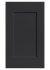
Black
Black cabinets remain a strong statement finish, especially in modern shaker and high-contrast kitchens. They create depth, sharpen hardware choices, and work well with white counters, light walls, and warm wood accents. Used well, black can make a kitchen feel tailored and high-end.
Used poorly, it can make the room feel smaller and more demanding to maintain. Fingerprints, dust, and surface smudges tend to show more clearly on darker finishes. Black also needs enough light and visual balance around it. In many projects, it performs best on an island or lower cabinets rather than throughout the entire kitchen.
Why two-tone kitchens are staying relevant
One of the clearest kitchen cabinet color trends is the continued strength of two-tone design. This approach gives more flexibility on budget, style, and layout. A homeowner can keep the room bright with white uppers while adding blue, sage, gray, oak, or black below. A builder can use a wood-tone island to create contrast without changing the full cabinet package. A designer can use color to define zones in an open-concept space.
Two-tone kitchens also solve practical visual problems. Large kitchens can feel repetitive in one finish, while small kitchens can feel crowded if the darker color is overused. Mixing finishes lets you control weight in the room. The caution is that two-tone only works when the undertones are compatible. Pairing a cool white with a warm wood or a green that clashes with the flooring can make the whole plan feel off even if each individual sample looks good.
How cabinet style affects color choice
Color does not live on its own. It always interacts with the door style. Shaker cabinets continue to dominate because they make color easier to read and easier to place in a wide range of homes. White shaker, blue shaker, sage shaker, and black shaker all feel current because the door profile stays clean and familiar.
Inset cabinets often benefit from colors with a little more depth because the tighter lines and shadow details add definition. Overlay styles can go either way, but in many projects they give buyers a little more freedom to use stronger finishes without the kitchen feeling overly formal. This matters when clients are choosing between stock and custom options. The same color can look different depending on whether it is used on inset or overlay construction.
Choosing a trend that still works three years from now
The safest approach is not to ignore trends. It is to filter them through project reality. Start with the fixed elements first. Flooring, countertops, wall color, backsplash, and lighting should narrow the color range before cabinet samples are compared. Then consider the user. A spec home, a long-term family kitchen, and a designer-driven custom remodel do not need the same answer.
Budget should stay in the conversation too. Stock colors often provide the best value and faster timelines, especially when they already align with what buyers want now. Custom colors make sense when the kitchen needs to match a very specific design direction or existing architectural elements. For many projects, ordering a sample door first is the most efficient way to avoid expensive guesswork.
This is also where practical support matters. A color that looks good online still has to work across the full layout, from tall pantry runs to sink bases and islands. Companies like RTA Wholesalers make that process easier by pairing broad stock and custom finish options with free 3D design support, which helps buyers confirm that the cabinet color works in the actual room instead of just on a screen.
The best cabinet color trend is the one that still makes sense after pricing, layout, lighting, and material choices are locked in. If a finish helps the kitchen look current, installs cleanly into the design plan, and supports the value of the project, it is not just on trend. It is the right call.